
Marketing Dashboard Guide: How to Build, Track, and Optimize Your Marketing Performance

A marketing dashboard brings every campaign metric, channel, and KPI into one visual workspace so teams can make faster, data-driven decisions. This guide walks you through what the tool is, why it matters, which metrics are worth tracking, the best software options available in 2026, and a step-by-step process for building a reporting hub your team will actually use. By the end, you’ll know exactly how to turn scattered marketing data into a single source of truth that drives real growth.
What Is a Marketing Dashboard?
A marketing dashboard is a visual reporting tool that pulls data from multiple channels — paid ads, email, social media, SEO, and website analytics — into one centralized view. Instead of logging into five or six different platforms to check performance, this kind of dashboard consolidates everything into charts, graphs, and tables that update automatically.
Think of it as mission control for your marketing team. Every campaign, every channel, and every dollar spent flows through the system, giving stakeholders a real-time snapshot of what’s working and what isn’t. A well-built reporting hub removes the guesswork from marketing and replaces it with clear, actionable insight, so decisions are grounded in evidence rather than assumptions.
Why Every Business Needs One

Marketing teams generate enormous amounts of data every single day, and without a centralized dashboard, most of that information goes unused. Here’s why this reporting layer has become essential for modern businesses:
- Faster decision-making: The dashboard gives you instant visibility into performance instead of waiting for weekly or monthly reports.
- Improved alignment: When everyone views the same numbers, teams stop arguing about whose spreadsheet is correct.
- Better budget allocation: The dashboard shows which channels deliver the strongest return, so you can shift spend accordingly.
- Early problem detection: Underperforming campaigns get flagged before they drain your budget.
- Stronger reporting to leadership: A polished, visual summary makes it easy to demonstrate ROI to executives and clients alike.
Without this kind of centralized system, teams waste hours pulling numbers from disconnected spreadsheets, and important trends often go unnoticed until it’s too late to act on them.
Key Components of an Effective Marketing Dashboard
Not every dashboard is built the same way. An effective marketing dashboard rests on four core building blocks:
- Data Sources — The output is only as strong as what feeds it. Common sources include Google Ads, Meta Ads, LinkedIn Ads, Google Analytics 4, your CRM, and email platforms.
- Raw Metrics — Numbers like impressions, clicks, sessions, and conversions form the foundation of any reporting system.
- KPIs (Key Performance Indicators) — Metrics tied to actual business goals, such as customer acquisition cost (CAC) or return on ad spend (ROAS), turn raw numbers into a genuine decision-making tool.
- Visualizations — Charts, graphs, and color-coded indicators make the data easy to read at a glance, even for non-technical stakeholders.
When these four elements come together, the dashboard becomes far more than a reporting tool — it becomes a strategic asset that shapes how the whole company thinks about performance.
Types of Dashboards You Can Build
Different teams need different views, so a one-size-fits-all marketing dashboard rarely works well in practice. Here are the most common variations businesses rely on:
- Executive Dashboard: A high-level marketing dashboard summarizing revenue, leads, and overall ROI for leadership.
- PPC Dashboard: Tracks ad spend, cost-per-click, and conversions across Google Ads and Meta Ads.
- SEO Dashboard: Focuses on organic traffic, keyword rankings, and backlinks.
- Social Media Dashboard: Displays engagement, follower growth, and reach across platforms.
- Ecommerce Dashboard: Combines sales data, cart abandonment rates, and customer lifetime value in one screen.
- Email Performance Dashboard: Shows open rates, click-through rates, and list growth over time.
Choosing the right variation depends entirely on who will use it and what decisions it needs to support.
Essential Metrics and KPIs to Track
A cluttered dashboard filled with irrelevant numbers is worse than no reporting tool at all. Focus a marketing dashboard on metrics that actually move the needle:
- Website Traffic — Sessions, users, and traffic sources
- Conversion Rate — Percentage of visitors who complete a desired action
- Customer Acquisition Cost (CAC) — Total spend divided by new customers
- Return on Ad Spend (ROAS) — Revenue generated per dollar spent
- Customer Lifetime Value (CLV) — Total revenue expected from one customer
- Cost Per Lead (CPL) — How much you spend to generate a single lead
- Bounce Rate — Percentage of visitors who leave without interacting
- Email Open and Click Rates — Engagement across email campaigns
A good reporting layout limits itself to seven or eight visualizations at most, keeping the view clean and easy to scan rather than overwhelming.
How to Build a Marketing Dashboard: Step-by-Step

Building a marketing dashboard doesn’t have to be complicated. Follow these steps to create a system that your team will actually open and use every day:
- Define Your Goals — Before touching any software, decide what questions the dashboard needs to answer for your business.
- Choose Your Data Sources — Identify every platform that will feed into it, from ad accounts to your CRM and email tool.
- Select the Right Software — Pick a platform that connects easily to your existing marketing stack without heavy manual work.
- Connect and Clean Your Data — Use automation or APIs so the numbers always reflect accurate, up-to-date figures rather than stale exports.
- Design for Clarity — Arrange the layout so the most important data appears first, ideally understandable within five seconds of opening it.
- Test With Real Users — Have team members interact with the finished dashboard before rolling it out company-wide.
- Review and Refine Quarterly — A good reporting tool should evolve as your goals, channels, and team structure change over time.
If you’re still working out how to organize incoming numbers before you even open dashboard software, our guide on how data reporting can transform your business breaks down the habits that make any dashboard genuinely useful.
Best Marketing Dashboard Tools in 2026
There’s no shortage of software for building this kind of reporting hub. Some popular options worth comparing include:
- Google Looker Studio (formerly Data Studio) — A free, flexible option for building a custom marketing dashboard from scratch.
- HubSpot — Combines CRM functionality with built-in reporting features in one platform.
- Tableau — A powerful choice for advanced, highly customized visualizations.
- Power BI — Popular with enterprise teams needing a robust dashboard connected to multiple data warehouses.
- Databox — Known for quick setup and mobile-friendly performance monitoring.
- Klipfolio — Offers ready-made templates that speed up the build process considerably.
If your team is still getting comfortable working with numbers, our beginner-friendly breakdown of data analytics tools is a useful next stop before you commit to any particular platform. For a deeper look from outside our own site, Mailchimp’s guide to building a marketing dashboard also offers practical visualization tips worth reading.
Design Best Practices That Keep a Dashboard Useful
A cluttered, confusing marketing dashboard gets abandoned fast, no matter how much data it contains. Follow these design principles to keep it effective over the long term:
- Prioritize the top metrics so the most important numbers sit at the very top of the screen.
- Use consistent colors throughout so viewers aren’t left guessing what red or green means in different charts.
- Avoid vanity metrics that make the dashboard look busy without actually adding decision-making value.
- Keep it mobile-friendly, since many stakeholders will check performance from their phones between meetings.
- Automate updates so the numbers being displayed are never stale or manually outdated.
Common Mistakes to Avoid
Even a well-intentioned reporting setup can fail if you fall into a few common traps:
- Tracking too many metrics, which turns a useful reporting tool into noise instead of insight.
- Ignoring data quality, since any dashboard built on bad data leads directly to bad decisions.
- Skipping user testing, meaning the finished product may confuse the very people it’s meant to help.
- Never updating it, which lets the whole system drift out of sync with your actual business goals.
If you’d like a broader look at how data quality issues affect reporting accuracy in general, check out our article on common data analysis challenges, many of which show up inside dashboards too.
Marketing Dashboard vs. Traditional Reporting
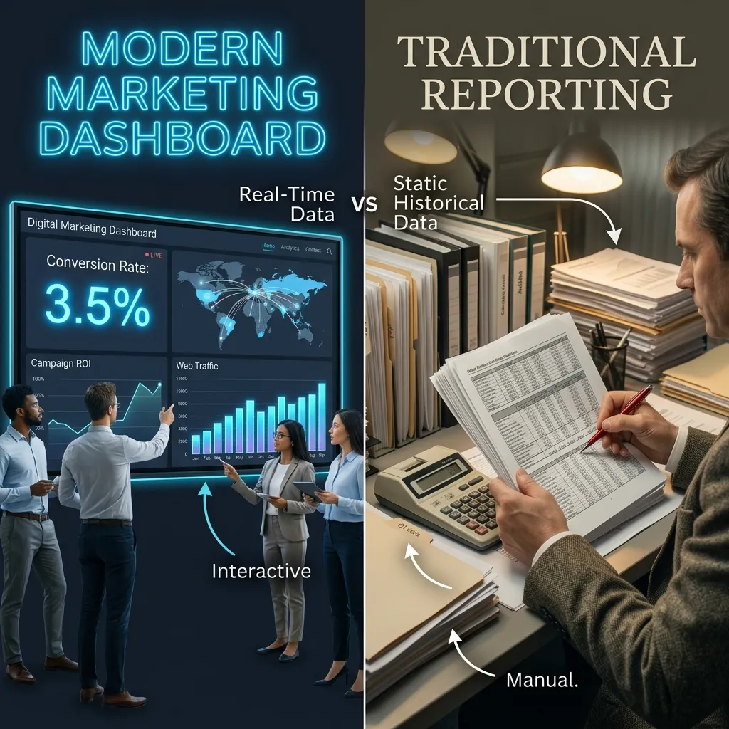
Traditional marketing reports are static — a snapshot frozen at the moment they’re created, often as a PDF or slide deck. A marketing dashboard, on the other hand, updates continuously, giving teams a living view of performance instead of an outdated document that’s already wrong by the time someone opens it. While formal reports still have a place for board meetings and client presentations, a live dashboard is far better suited for day-to-day decision-making, quick pivots, and ongoing optimization throughout the month.
Who Should Use a Marketing Dashboard?
Almost every role on a marketing team benefits from this kind of centralized view. Paid media managers use it to catch underperforming ad sets early. Content teams rely on it to see which articles drive the most organic traffic. SEO specialists track keyword movement and backlink growth in one place instead of switching between multiple tools. Executives use a simplified, high-level version to understand overall marketing ROI without digging into granular campaign data themselves. Even sales teams benefit when marketing dashboards are connected to CRM data, since it helps them understand which leads are most sales-ready.
Conclusion
A well-built marketing dashboard turns scattered data into clear, actionable insight, helping teams make faster decisions, prove ROI, and spend budget more wisely across every channel. Whether you’re a solo entrepreneur tracking a handful of numbers or an enterprise team managing dozens of campaigns, investing time into building the right reporting system pays off quickly. Start small, focus on the KPIs that matter most to your specific goals, choose software that fits your team’s skill level, and refine the layout regularly as your business evolves. Done right, a marketing dashboard becomes one of the most valuable tools in your entire marketing stack, and one your team will actually open every single day.
For more on interpreting the numbers your dashboard collects, explore our guide on what data analytics really means for marketers just getting started.
Frequently Asked Questions
1. What is a marketing dashboard used for?
It’s used to consolidate performance data from multiple channels into one visual view, helping teams track KPIs and make faster decisions without switching between platforms.
2. How often should I update the dashboard?
Most teams connect it to automated data feeds so numbers update in real time, but manual reviews should still happen weekly or monthly.
3. What metrics belong on the dashboard?
Focus on traffic, conversion rate, CAC, ROAS, CLV, and cost per lead rather than trying to track every metric your platforms make available.
4. Which tool is best for building one?
It depends on your budget and technical needs — Looker Studio and HubSpot work well for smaller teams, while Tableau and Power BI suit larger enterprises with complex reporting needs.
5. Can small businesses use a marketing dashboard?
Yes. Many small businesses start with a simple spreadsheet-based version before upgrading to dedicated software as their data needs grow more complex.
6. How many metrics should it include?
Most experts recommend limiting any single view to seven or eight visualizations to keep it clear and scannable at a glance.
7. Is a marketing dashboard the same as a CRM?
No. A CRM manages customer relationships and sales pipelines, while a dashboard focuses on visualizing marketing performance data, though the two often connect and share data.
8. What’s the difference between a dashboard and a report?
A dashboard updates continuously and is interactive, while a report is a static document created at a fixed point in time and doesn’t change afterward.
9. How do I choose KPIs for my marketing dashboard?
Choose KPIs that connect directly to business goals, such as revenue or customer acquisition cost, rather than surface-level metrics like impressions alone.
10. Can it integrate with Google Analytics?
Yes, most modern platforms integrate directly with Google Analytics 4 along with major ad platforms and CRM systems.
11. Why do marketing dashboards fail?
They typically fail because the view is too cluttered, built on poor-quality data, or never updated to match evolving business goals and team priorities.
12. Do I need coding skills to build one?
Not necessarily. Most platforms today offer drag-and-drop builders, though advanced customization may require some technical knowledge or developer support.